Project Overview:
This festival design was a 10 week class project where we designed a theoretical festival with different limitations like being on University of Washington campus, accommodate for certain amount of people, and focus on accessibility for a wide demographic.
My Role:
- UX Designer
- Visual Design
- Design ideation and research
- Usability tests
Year: 2024
Duration: 3 Months
Creating a Narrative
While ideating on what my festival was going to have, I did research on what current festivals consumers expect and ideated on what I wanted my festival to have. Concept development
I researched 3 other food festival type events. From this research, I learned rdtfyg and ytuij. I wanted rtfygu in my festival because xetrcyvuijo.
To incorporate this I did xdtfcygvuhbijn.
The Cheese Rolling at Cooper's Hill is a unique event where people go up on Cooper's Hill and run after a whole wheel of cheese. Pros for this festival were it is free to attend and cheese or running enthusiast can connect with each other. Cons are many people get injured and there is not much interaction other than the run.
The Gilroy Garlic Festival is a garlic based festival that celebrates the town of Gilroy. Pros for this festival are that it brings people together to celebrate garlic and the town, as well as fundraising funds for charities. Cons are it is very local.
The International Dinner hosted by Seattle University called "We Are The World" that showcases a diverse group of cultures and allow customer to immerse themselves into other cultures with traditional food, dances, and clothes. Pros for this were sharing ones culture and learning others cultures as well. Cons are the accessibility to the public is not much since it is hosted at a private university.
Using this information, aspects I wanted to provide and have for my festival was making sure there was focus on making the festival design and app accessible for all demographics
As my festival design developed, I created personas to help imagine and solidify what users would need.
This helped with creating a customer journey.
- I created three personas based on interviews of potential customers and research information found. Each persona had their own background and experiences that offer different perspectives towards festivals and the processes before, during and after the festival. These personals helped create a more targeted wireframe and more focused problem space.
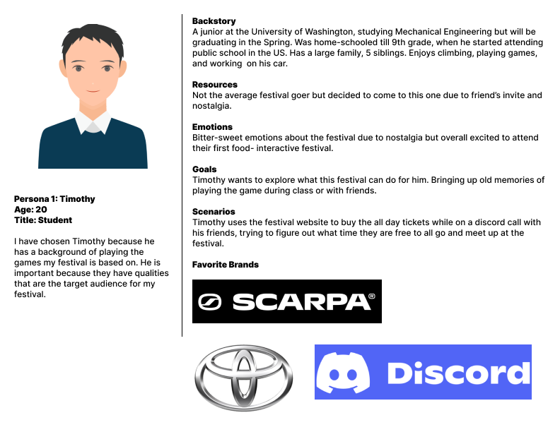
Persona 1 that had the ytvui aspect of most users
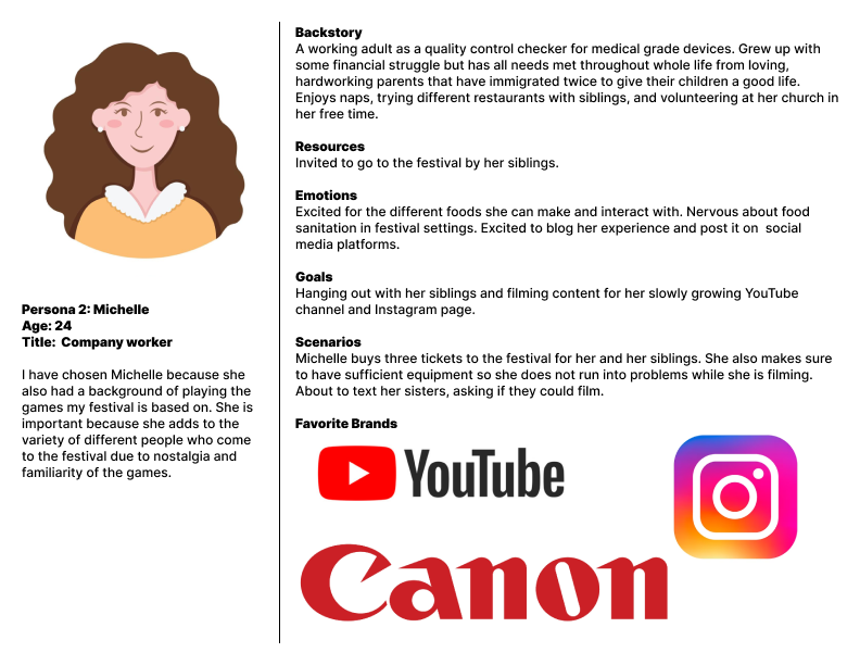
Persona 2 that had the ytvui aspect of most users
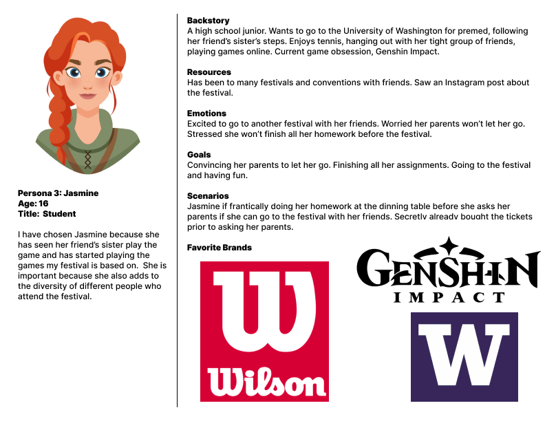
Persona 3 that had the ytvui aspect of most users
For creating a festival that stands out, we need to understand the user and their past experiences. With the persona names Michelle, the customer journey creates a path of how I should tailor to the customer. Main points I focused on was to create an app that aid in seamless connection between pre, during and post festival activities. Specifically designing an easy way to purchase and access tickets as well as maps and festival information.
What makes this different than the games?
Initial Aesthetic and Mood board
While wanting to create the theme of creating the feel of a place where people can come and physically walk down memory lane through playing mini games and eating foods from the games, I got inspiration from the Flipline Studio Papa's games. I also wanted to include aspects of restaurants but continuing to carry the friendly and easy going aesthetic.
Deciding the Colors
Even though the Flipline Studio games are known for having bright, vibrant colors, I decided have a more muted aesthetic for the color choice or my festival. When designing the color pallet, I found that all the bright colors were too much and would take attention away from the content. To combat this, muting the colors and creating a softer aesthetic helped emphasize content over purely colors. An important aspect of choosing these specific colors was making sure the passes the WCAG AAA requirements, making sure all users can enjoy the visuals of this project.
Deciding Typography
When deciding what type of font and aesthetic I wanted for the text for this project, I tried finding a font that was bold and causal but also wanted a clean and a little more formal font as well. Outfit, a San Serif font gave the minimalistic, bold, yet casual vibe while Julius Sans One, also a San Serif font, gave a clean and pizzazz to the typography. Using a mix of these fonts in the posters, infographics, tickets, etc. characterizes the information as well as keeping the aesthetic clean yet welcoming.
Wordmark
I wanted the wordmark to be simple and minimalistic while still having a little but of personality. I added a lowercase letter "E" in the wordmark to help make the bold seem more friendly I chose the word "open" as my title, signifying restaurants having open signs and the festival being open for all.
Visual Designs
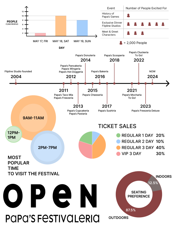
Initial Infographic
Final Iteration
Infographic
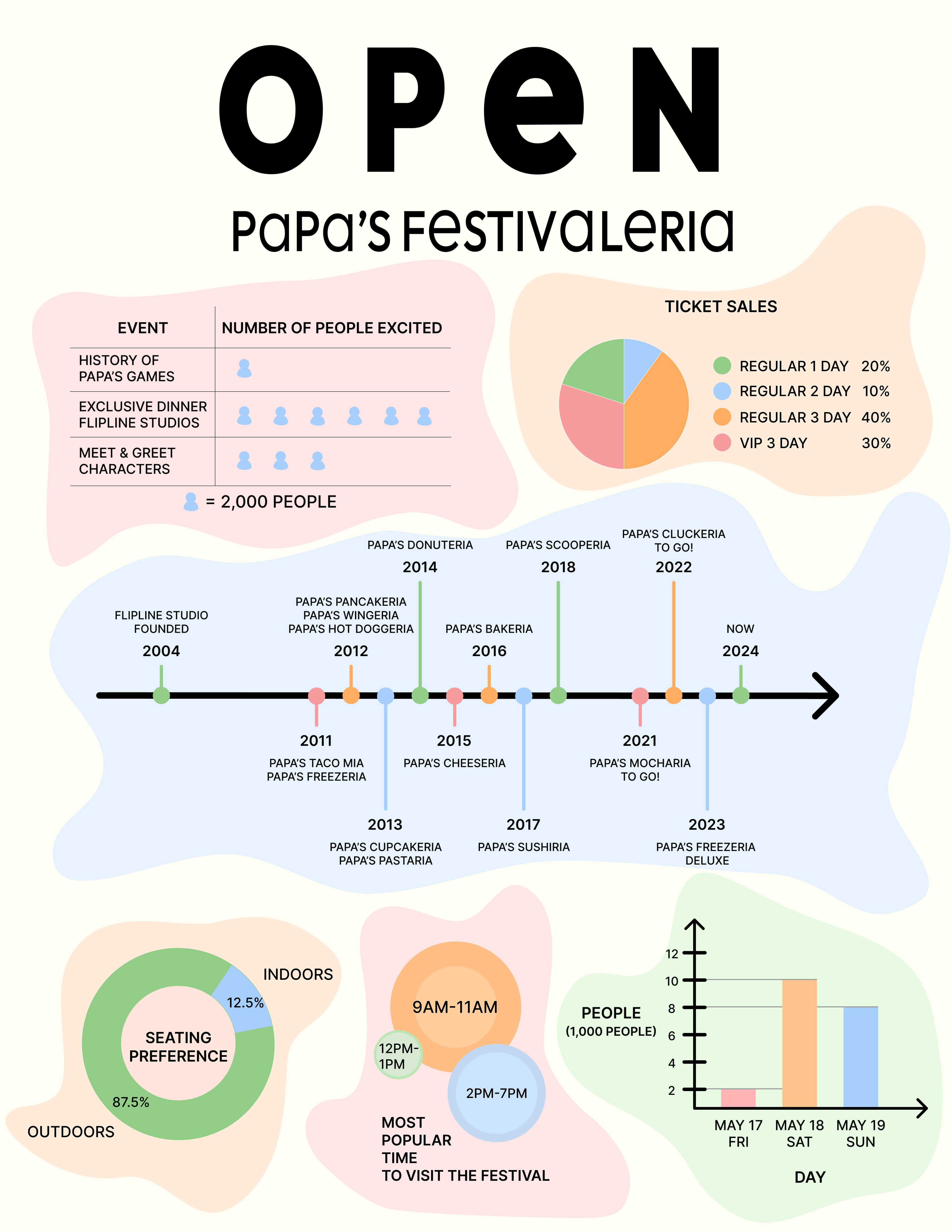
Using data from an online survey I created, my initial iteration of my infographic did not integrate the mood board ideas very well. During peer feedback and workshopping, some feedback I acted on was each item of the infographic bled into each other. To solve these issues I added boarders around each chunk of information as well as implementing more colors to create a more cohesive design.
Ticket Redesign
When designing the ticket, I really wanted to create a functional ticket that can also be saved as a memorable for the festival. Making the ticket 2 times the size of a credit card allows users to have a lot of information on the ticket as well as having the ability to fold the ticket so it fits easily into someone's wallet or pocket. I designed ticket and purposefully put selective information on the inside and outside to allow for easy use and accessibility to important information users may need to access quickly.
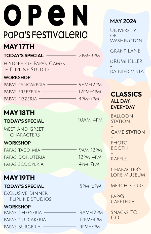
Festival Poster
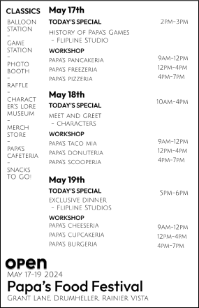
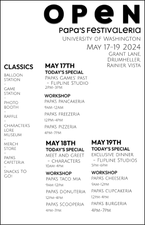
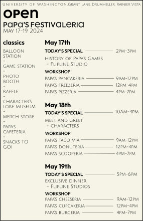
When creating the poster, I began with creating the poster without color and minimal design to make sure the content stands out and is understandable. As I iterated many and many more posters, I introduced color as well as some design aspects that would allow for a continual aesthetic to the other visual aspects of the project.
Map
While making the map, I decides what key features would be needed for customers who were not familiar with campus and making sure there was enough information and routes for all customers, no matter the mode of transportation or accessibility needs to be able to stroll to and through the festival.
Initial Design
Iteration 1
Iteration 2
Final Desgin
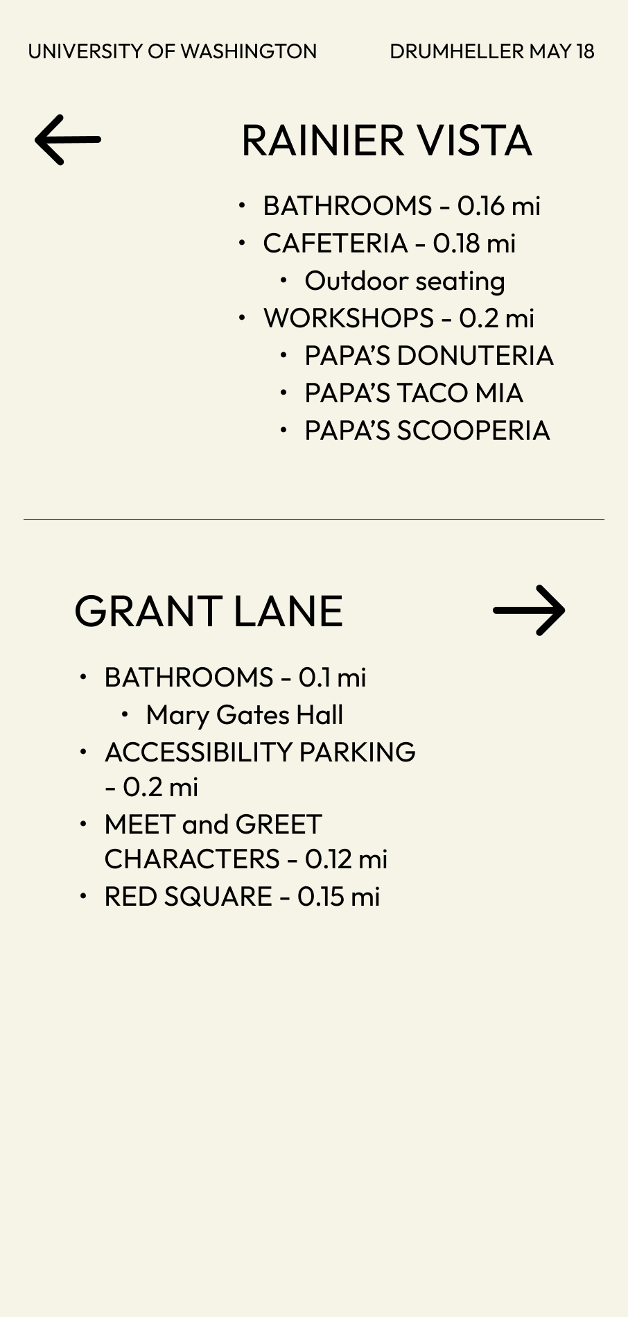
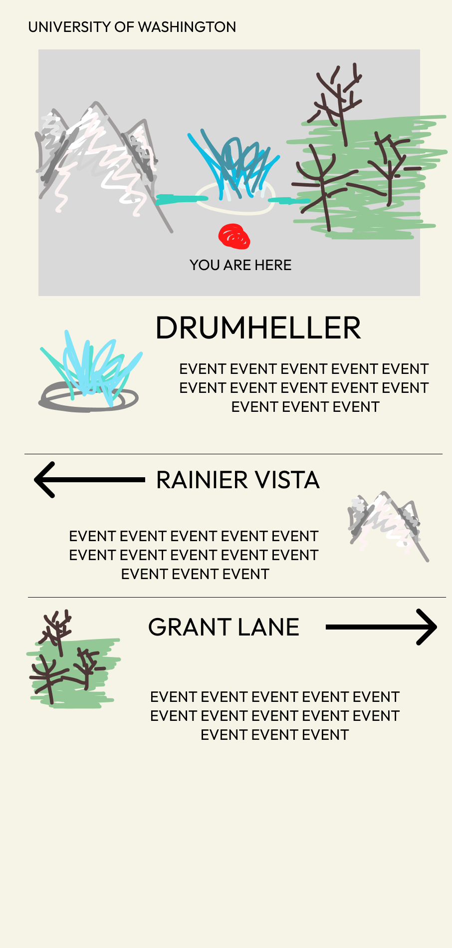
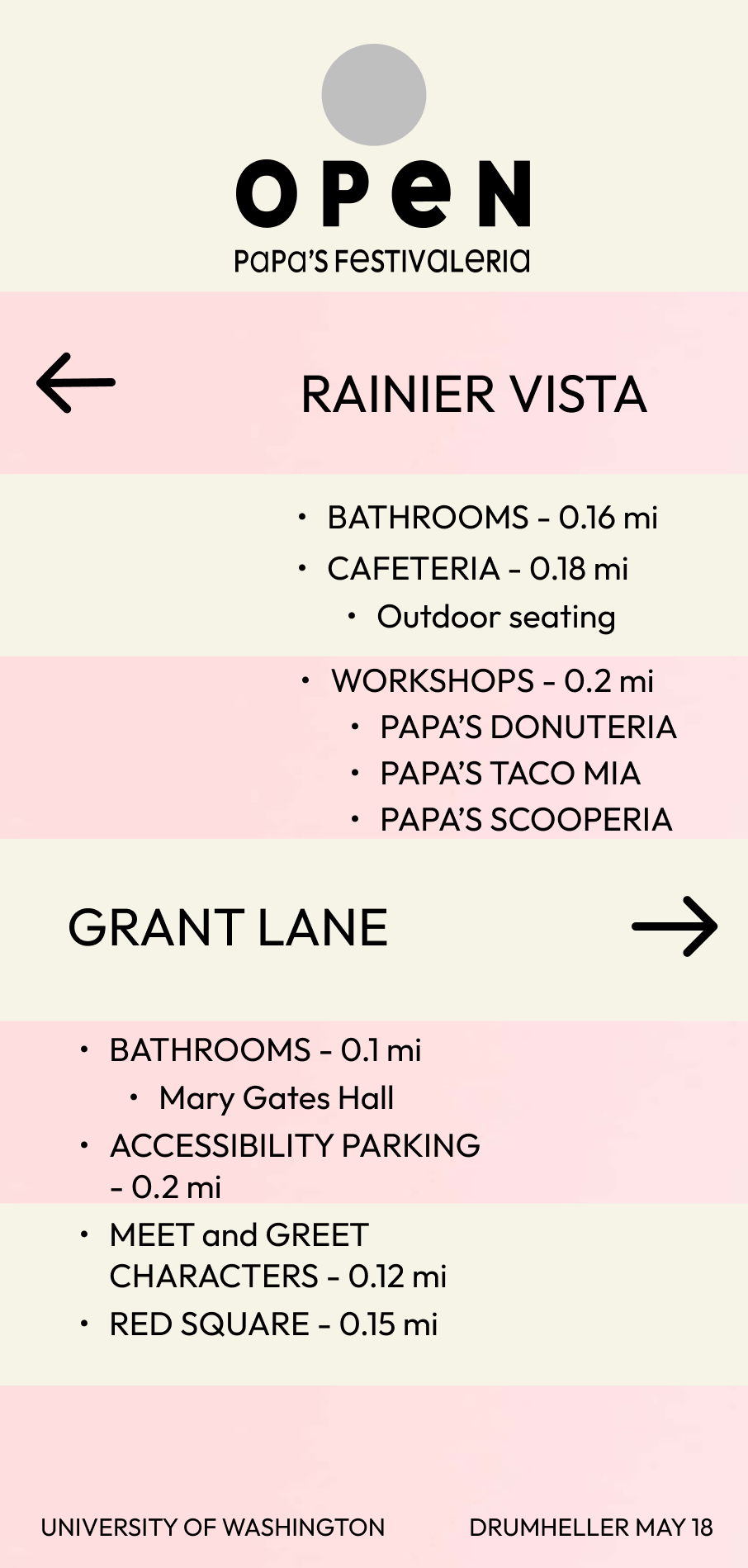
Signage
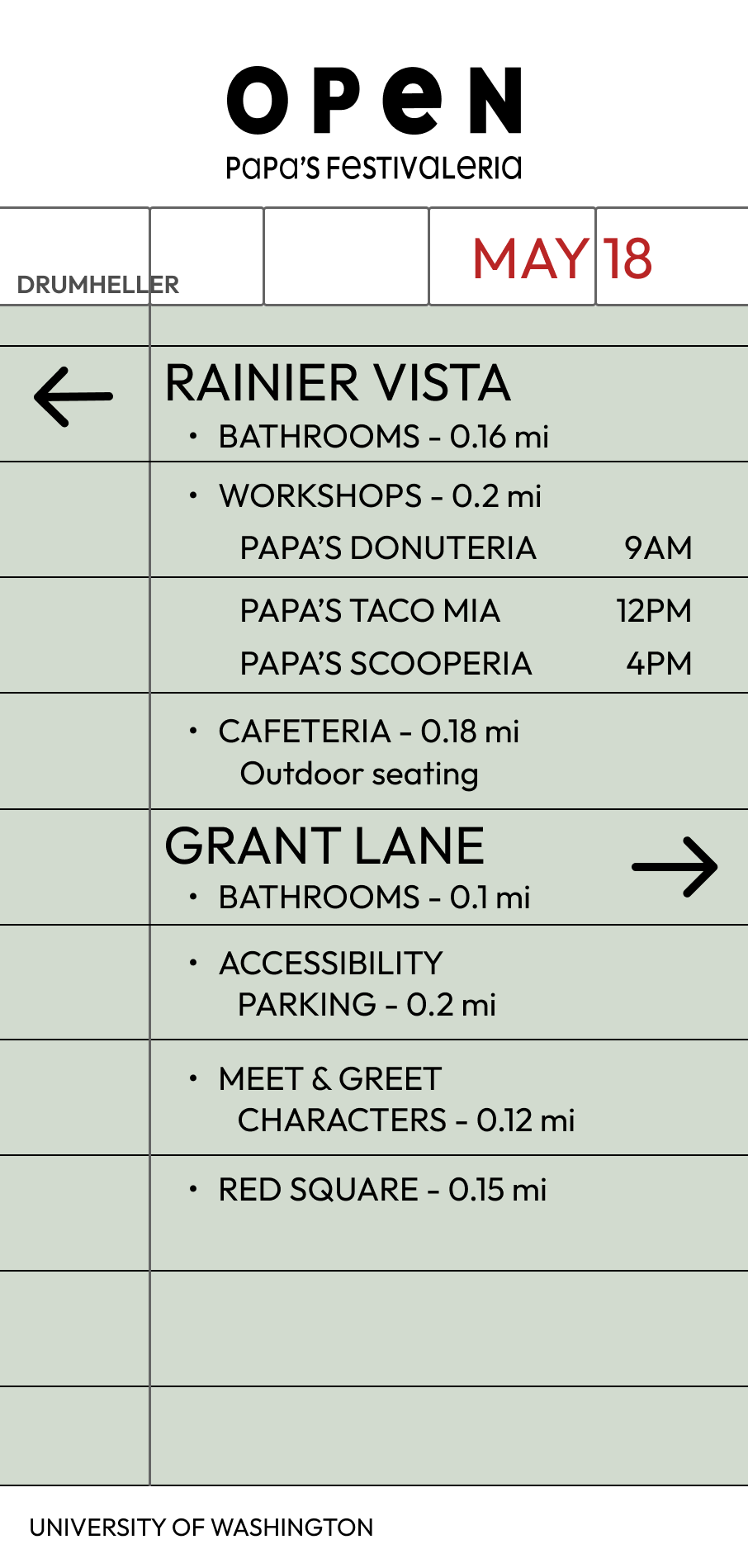
The signage design had many many iterations. I went from having a simple design to making a more restaurant order ticket style to keep the restaurant aesthetic present in the signage. Although the colors of the signage is not as seamless with the other aspects of the project, this is supposed to be implemented on campus, inside and around the festival. I chose to mute the colors and not have so many because when at the festival, customers may feel overwhelmed with all the people, booths, and activities going on. Having a more plain directional signage allows users to take a break from all the chaos and reduce the amount of visual noise they perceive.
Mobile Interface and Prototype
User Flow
Before creating the prototype, I created a user flow to map out what I wanted the users experience when using my app. In this user flow, the user starts at the home page, where they go to buy a ticket. This leads them to a page that shows ticket options, ability to choose one and sends the user to the cart screen. At this point the user can chose to continue shopping for more tickets or proceed to checkout. After checking out, the user is shown the purchase confirmation.
Tile Design
For the buttons and tile design, I decided to go for round buttons that start off with a soft color, to implement the same aesthetic as the other design visuals have. In the hover and pressed states, I change the colors to a more strong and bold one to emphasize and clearly show where the user's cursor is and what it is doing.
For the icons, I designed icons that are straight forward as well as including a splash of food related items to ensure a clear connection between the item and the overarching theme of the project.
App Prototype
Icon Static, Hover, Focus, and Active Example
Color change and icon Style change highlighted with a red outlined box.
First three wireframes show the changes in the back button. The next 2 show the changes in the "continue shopping button". The last two show the change in the "buy now" button.